Set up applet capsules
1. Effect show
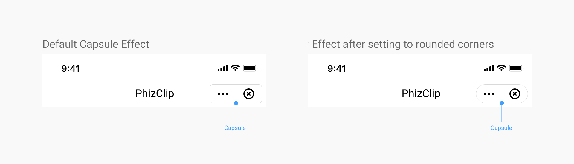
2. Set applet capsule UI style
2.1 Coverage
Once set, all the applets in the app will be implemented according to this effect.
2.2 iOS setup method
When initializing the SDK, configuration is done via the CapsuleConfig class:
//Set the width of the top-right capsule view to 88
[FATClient sharedClient].uiConfig.capsuleConfig.capsuleWidth = 88;
Description of specific configurable items:
/**
 The width of the capsule view in the upper right corner, default value is 88
 */
@property (nonatomic, assign) CGFloat capsuleWidth;

/**
 The height of the top-right capsule view, the default value is 32
 */
@property (nonatomic, assign) CGFloat capsuleHeight;

/**
 The right margin of the top-right capsule view, the default value is 10
 */
@property (nonatomic, assign) CGFloat capsuleRightMargin;

/**
 The radius of the rounded corners of the upper right capsule view, the default value is 5
 */
@property (nonatomic, assign) CGFloat capsuleCornerRadius;

/**
 The border width of the top-right capsule view, default value is 0.8
 */
@property (nonatomic, assign) CGFloat capsuleBorderWidth;

/**
 Light color of the border in the upper right corner of the capsule view
 */
@property (nonatomic, strong) UIColor *capsuleBorderLightColor;

/**
 Dark color of the border of the capsule view in the upper right corner
 */
@property (nonatomic, strong) UIColor *capsuleBorderDarkColor;

/**
 Light color of the background of the upper right capsule view
 */
@property (nonatomic, strong) UIColor *capsuleBgLightColor;

/**
 Dark background color for capsule view in the upper right corner
 */
@property (nonatomic, strong) UIColor *capsuleBgDarkColor;

/**
 Image object for the light-colored more buttons in the capsule, if not passed, the default icon will be used
 */
@property (nonatomic, strong) UIImage *moreLightImage;

/**
 Image object for the darker more buttons in the capsule, if not passed, the default icon will be used
 */
@property (nonatomic, strong) UIImage *moreDarkImage;

/**
 The width of more buttons in the capsule, equal in height and width
 */
@property (nonatomic, assign) CGFloat moreBtnWidth;

/**
 The left distance of the more button in the capsule
 */
@property (nonatomic, assign) CGFloat moreBtnLeftMargin;

/**
 Image object for the light-colored more buttons in the capsule, if not passed, the default icon will be used
 */
@property (nonatomic, strong) UIImage *closeLightImage;

/**
 Image object for the darker more buttons in the capsule, if not passed, the default icon will be used
 */
@property (nonatomic, strong) UIImage *closeDarkImage;

/**
 The width of the close button in the capsule, equal in height and width
 */
@property (nonatomic, assign) CGFloat closeBtnWidth;

/**
 The left distance of the close button in the capsule
 */
@property (nonatomic, assign) CGFloat closeBtnLeftMargin;

/**
 The light color of the dividing line in the capsule
 */
@property (nonatomic, strong) UIColor *capsuleDividerLightColor;

/**
 The dark color of the dividing line in the capsule
 */
@property (nonatomic, strong) UIColor *capsuleDividerDarkColor;
2.3 Android setup method
When initializing the SDK, configuration is done via the CapsuleConfig class.
FinAppConfig.UIConfig uiConfig = new FinAppConfig.UIConfig();
CapsuleConfig capsuleConfig = new CapsuleConfig();
uiConfig.setCapsuleConfig(capsuleConfig);
Description of specific configurable items:
/**
 * Capsule button configuration
 */
public static class CapsuleConfig {

    /**
     *  The width of the capsule view in the upper right corner, default value is 88
     *
     */
    public float capsuleWidth = 88;

    /**
     *  The height of the top-right capsule view, the default value is 32
     *
     */
    public float capsuleHeight = 32;

    /**
     * Distance to the right of the top right capsule view
     */
    public float capsuleRightMargin = 7;

    /**
     *  The radius of the rounded corners of the upper right capsule view, the default value is 5
     *
     */
    public float capsuleCornerRadius = 5;

    /**
     *  The border width of the top-right capsule view, default value is 0.8
     *
     */
    public float capsuleBorderWidth = 1f;

    /**
     * Capsule background color light color
     */
    public int capsuleBgLightColor = 0x33000000;

    /**
     * Capsule background color dark
     */
    public int capsuleBgDarkColor = 0x80ffffff;

    /**
     *  Light color of the border in the upper right corner of the capsule view
     *
     */
    public int capsuleBorderLightColor = 0x80ffffff;

    /**
     *  Dark color of the border of the capsule view in the upper right corner
     *
     */
    public int capsuleBorderDarkColor = 0x26000000;

    /**
     * Capsule divider light color
     */
    public int capsuleDividerLightColor = 0x80ffffff;

    /**
     * Capsule divider dark color
     */
    public int capsuleDividerDarkColor = 0x26000000;

    /**
     *  Image object for the light-colored more buttons in the capsule, if not passed, the default icon will be used
     *
     */
    public int moreLightImage = R.drawable.miniapps_more_light;

    /**
     *  Image object for the darker more buttons in the capsule, if not passed, the default icon will be used
     *
     */
    public int moreDarkImage = R.drawable.miniapps_more_dark;

    /**
     *  The width of more buttons in the capsule, equal in height and width
     *
     */
    public float moreBtnWidth = 32;

    /**
     *  The left distance of the more button in the capsule
     *
     */
    public float moreBtnLeftMargin = 6;

    /**
     *  Image object for the light-colored more buttons in the capsule, if not passed, the default icon will be used
     *
     */
    public int closeLightImage = R.drawable.miniapps_close_light;

    /**
     *  Image object for the darker more buttons in the capsule, if not passed, the default icon will be used
     *
     */
    public int closeDarkImage = R.drawable.miniapps_close_dark;

    /**
     *  The width of the close button in the capsule, equal in height and width
     *
     */
    public float closeBtnWidth = 32;

    /**
     *  The left distance of the close button in the capsule
     *
     */
    public float closeBtnLeftMargin = 6;
}
3. Hide the "More" button
3.1 Coverage
The configuration is set by the applet itself, and each applet displays different effects according to its own configuration.
3.2 Setting method
In the applet app.json, change the configuration of the global window window
{
  "window":{
    "navigationBarHideMoreButton": true
  }
}
4. The way to hide the close button when opening animations in applets
4.1 Coverage
This setting is implemented by the App, once set, all applets in the App will be implemented according to this effect.
This method is mainly used to handle whether to hide the close button of the navigation bar during the loading of the applet (the applet service layer is not yet loaded successfully and the base library has not yet passed the applet configuration information to the SDK).
4.2 iOS setup method
When initializing the SDK, configuration is done via the CapsuleConfig class.
//Hide the close button when the applet opens with an animation
[FATClient sharedClient].uiConfig.hideTransitionCloseButton = YES;
4.3 Android setup method
When initializing the SDK, it is configured via UIConfig, as follows.
// UI Configuration
FinAppConfig.UIConfig uiConfig = new FinAppConfig.UIConfig();
// Whether to hide the top right corner close button
uiConfig.setHideNavigationBarCloseButton(true);
5. How to hide the close button after the applet is fully opened
5.1 Coverage
The configuration is set by the applet itself, and each applet displays different effects according to its own configuration.
5.2 Setting method
In the applet app.json, change the configuration of the global window window
{
  "window":{
    "navigationBarHideCloseButton": true
  }
}