Visual Guidelines
PhizClip PhizClip supports a variety of flexible customization methods, in order to make the overall visual unity of the applet, the following conventions are made, developers can design UI according to this convention.
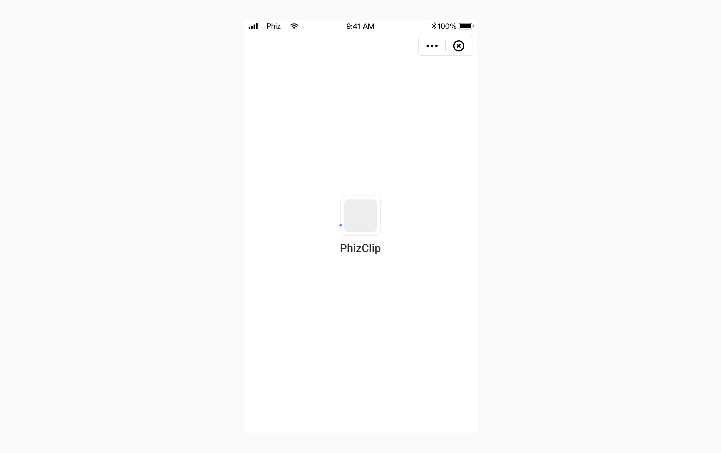
1. PhizClip Menu
1.1 Capsule control
The "More" menu of the PhizClip can be opened by the "..." icon in the upper right corner of the PhizClip, and by default, there are three buttons: "Forward", "Back to Home" (grayed out by default when it is already on the home page) and "Complaint Feedback".
The default size of the capsule control is as follows:
- Overall width dimension: 88.
- Total height dimension: 32.
- Capsule right side distance: 10.
- Capsule fillet radius: 5.
- Capsule border width: 0.8.
In addition to these three basic button functions, developers can also inject other functions by themselves. For the functions injected by themselves, please follow the icon design shown below.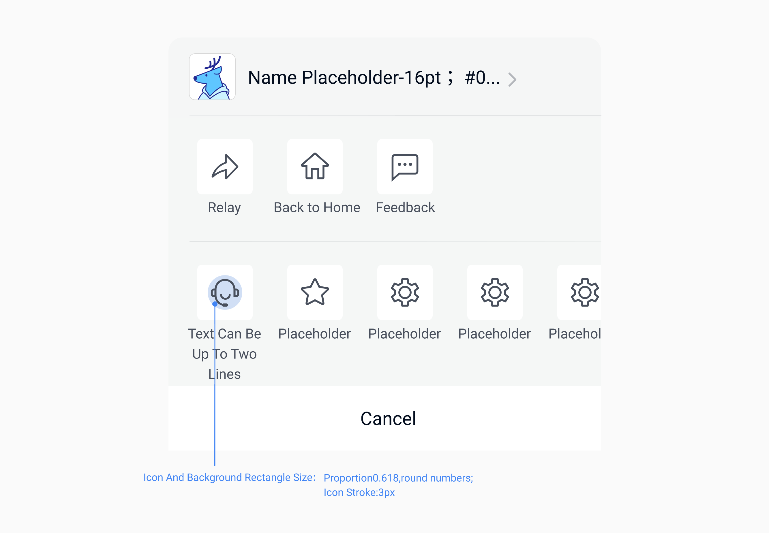
1.2 PhizClip menu dark and light color scheme
Developers can choose dark or light color applet menu according to the interface needs to create a design style suitable for mini-apps.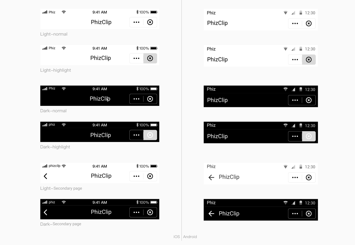
2. Fonts&Colors
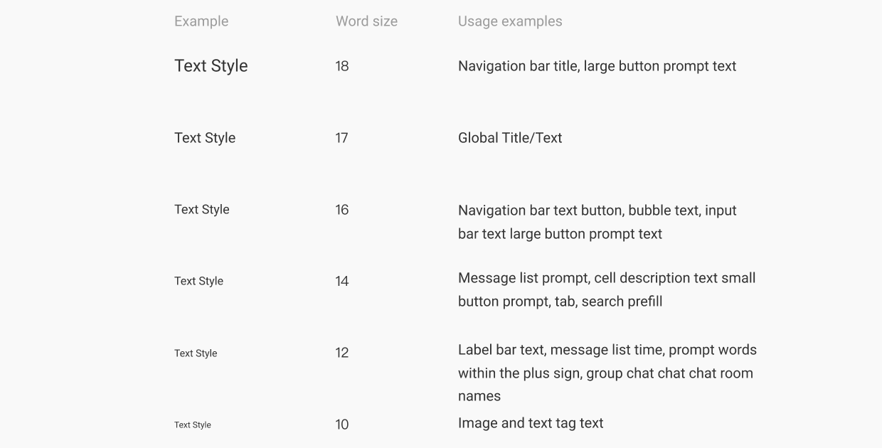
2.1 Fonts
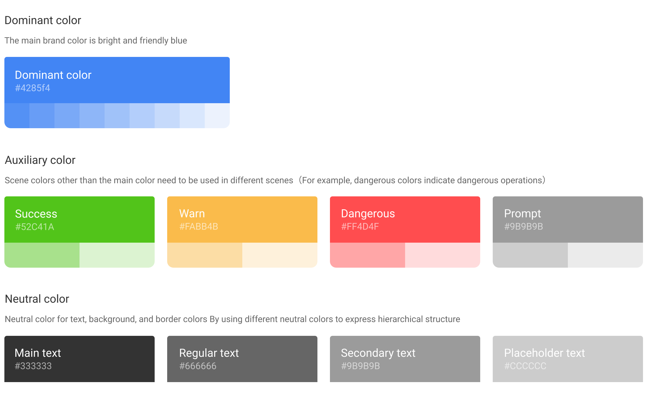
2.2 Colors
3. Basic controls
3.1 Start loading
3.2 Tabs
Provide leveled areas to organize and present large chunks of content, keeping the interface neat and tidy.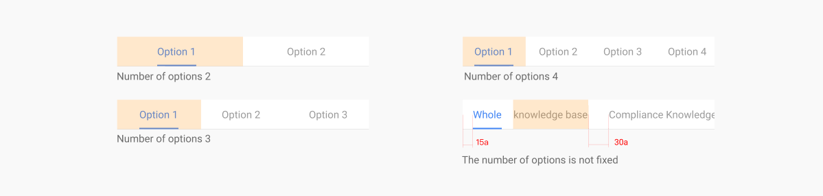
3.3 Bottom tab bar
Generally fixed at the bottom for different paging entries. The number of tabs is not less than 2 and not more than 5.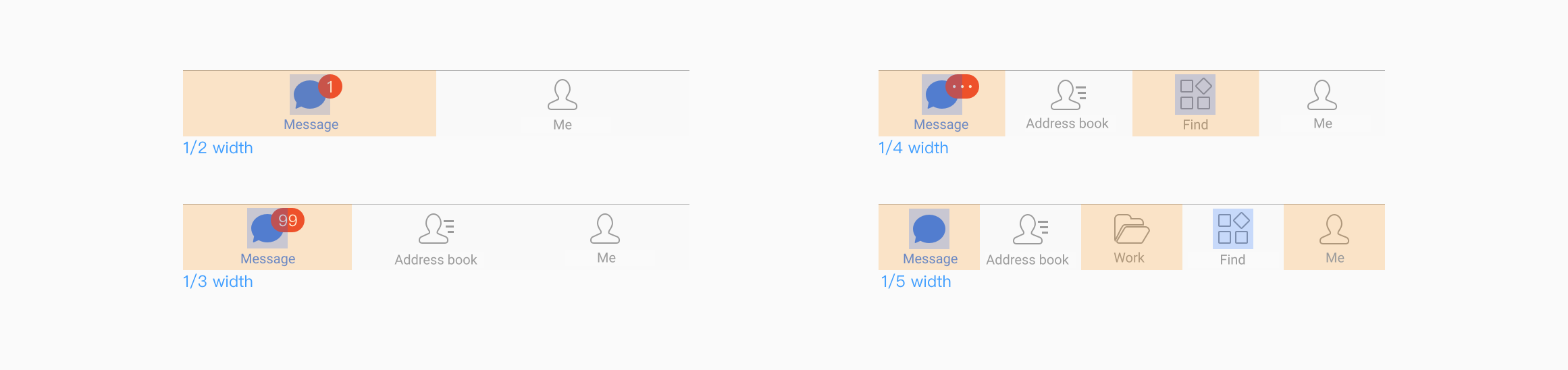
3.4 Buttons
The buttons used are mainly divided into main buttons, secondary buttons, and text buttons, of which
- Primary button: used for the primary action point, and there can be only one primary button for an action area.
- Secondary button: used for the most secondary action point.
- Text button: used as an external action point.
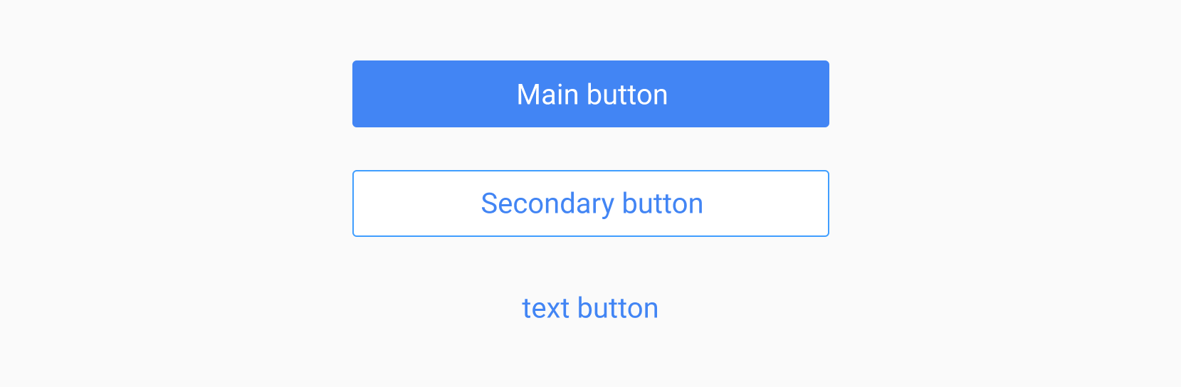
The response state of the button contains 3 types, which are.Normal, Press, Disable.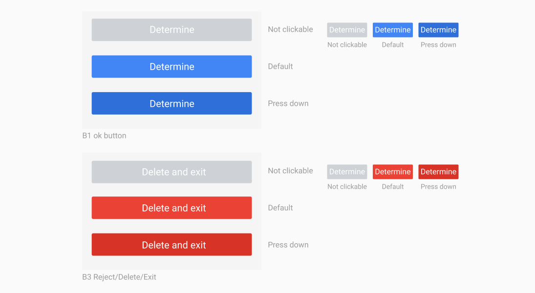
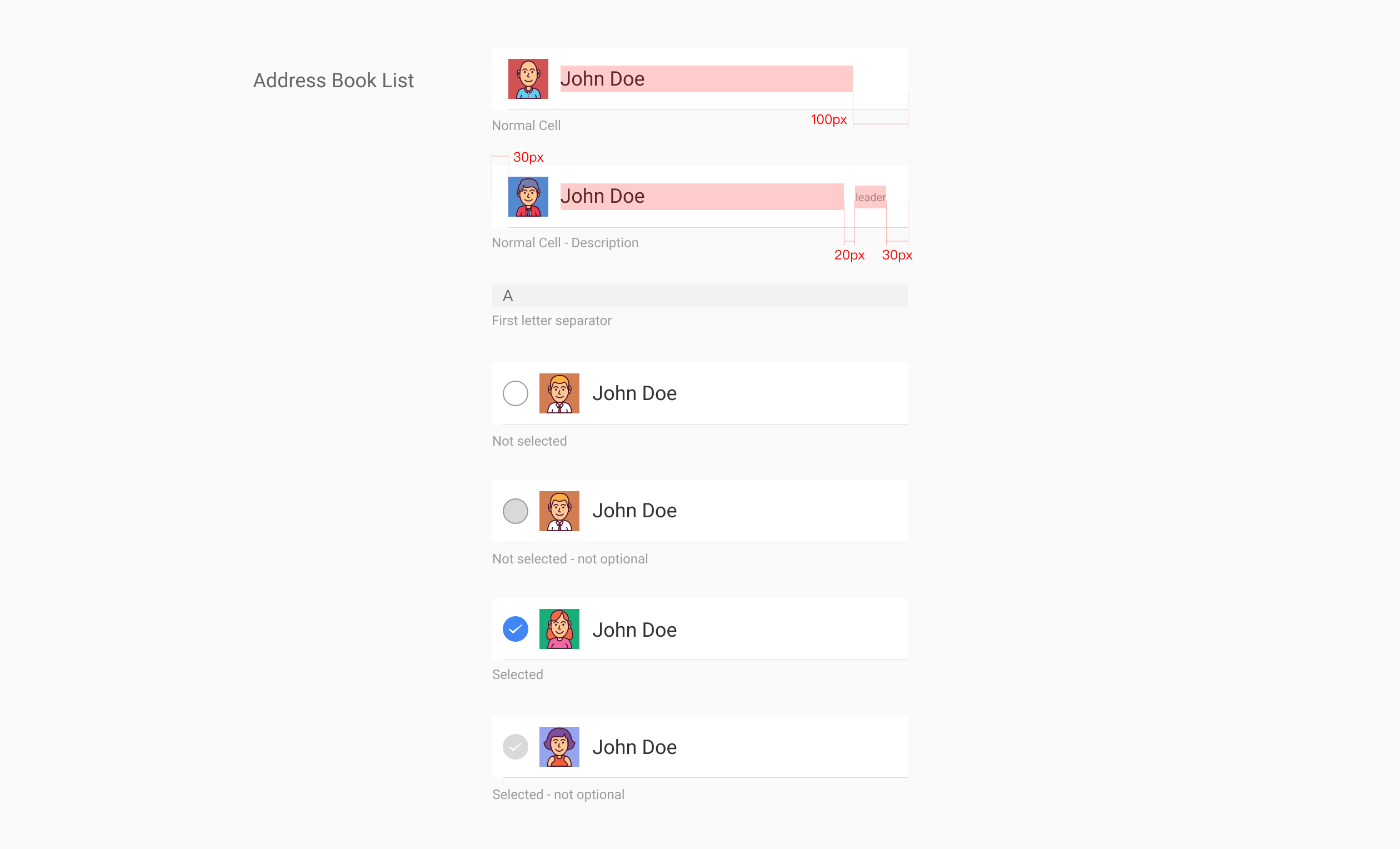
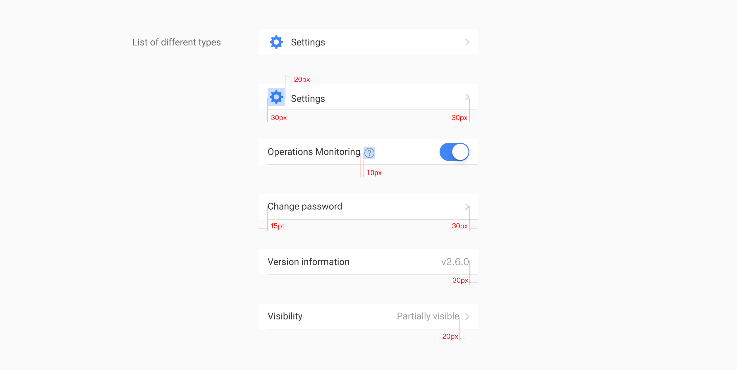
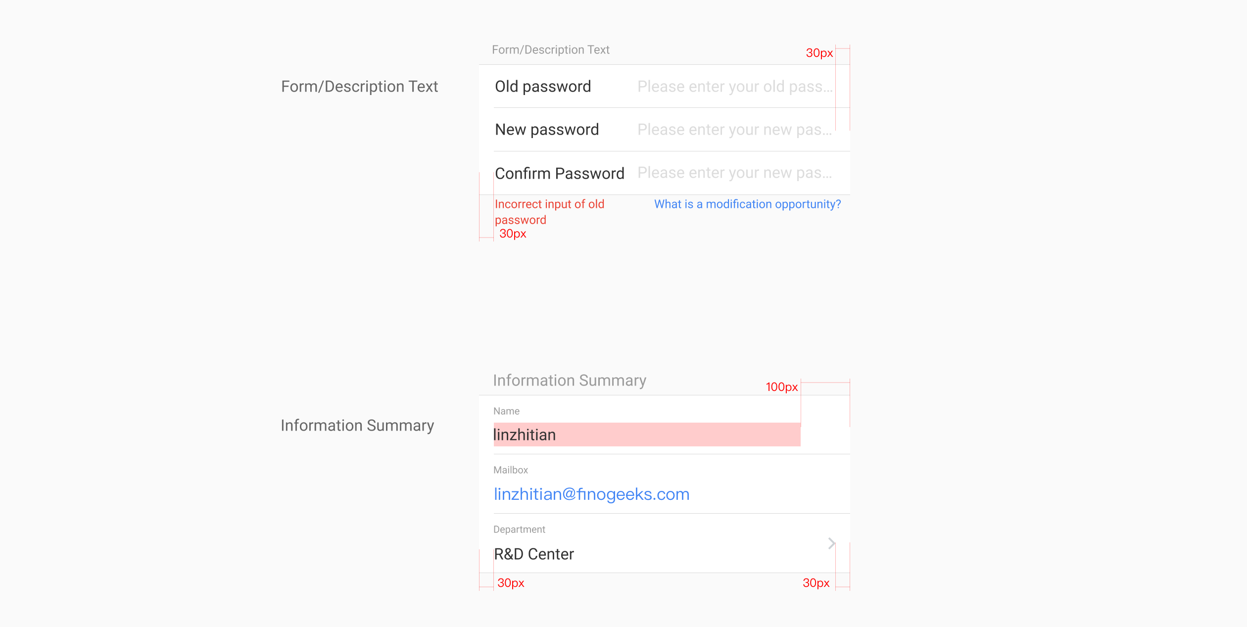
3.5 Lists