Widescreen General Adaptation Rules
1. Overview
PhizClip PhizClip supports large screens (PC/TV/car tablet, etc.), ensures clear and readable content, easy operation of interface elements, establishes efficient, friendly and consistent user experience, and maximizes adaptation and support for different needs, this guideline provides suggestions related to widescreen adaptation for reference.
2. Widescreen adaptation
On PC/TV/car tablet, the layout of the applet can be optimized because the view is larger to show more information.
2.1 Adaptation principle
Vertical screen: 414×736 in mobile size 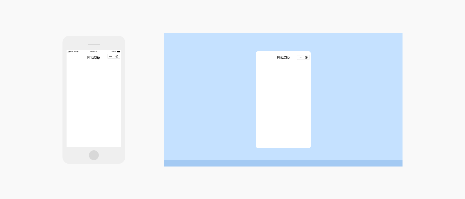
Landscape: Displayed in flat size 768 x 1024 
2.2 Adaptation layout optimization
(1) Left and right layout: make full use of the screen width, page elements left and right layout to improve view utilization 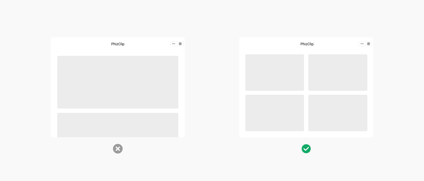
(2) Free layout: the content layout is properly redesigned so that the elements are fully displayed in the view 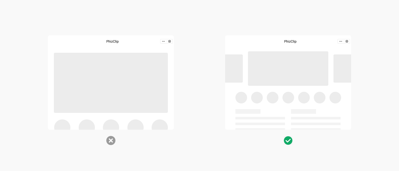
(3) A more suitable navigation method: the horizontal navigation bar will be changed to a sidebar style to better distinguish the interface primary and secondary relationships 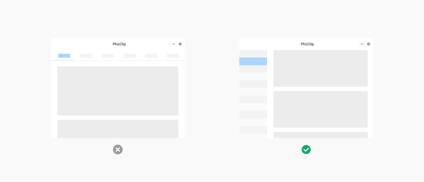
3. Widescreen Interaction Adaptation
3.1 PC-side interaction adaptation
PC side relies on mouse and keyboard operation, need to translate mobile side gestures to mouse operation 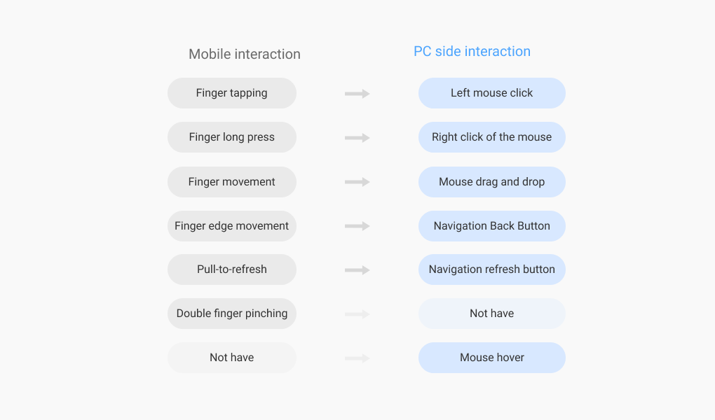
3.2 TV-side Interaction Adaptation
The TV side relies on the remote control to interact with the TV, and needs to clarify the current cursor location and prompt the selected or hovered elements 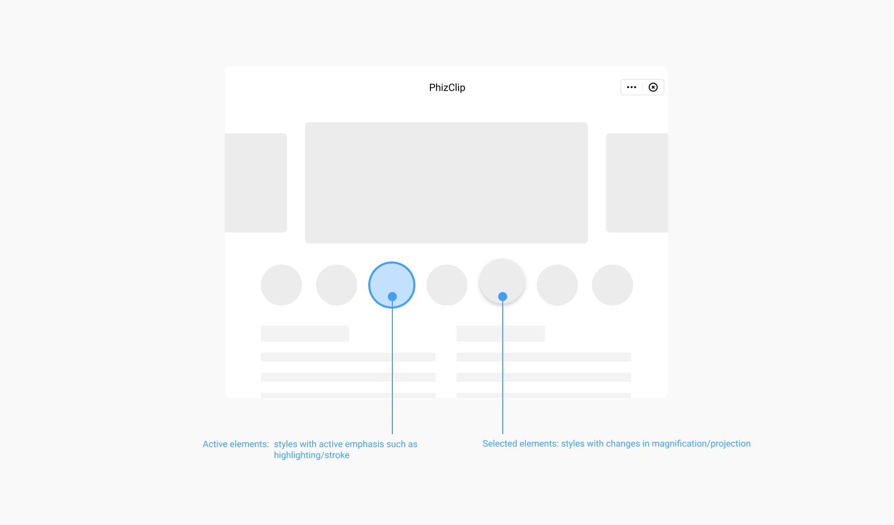
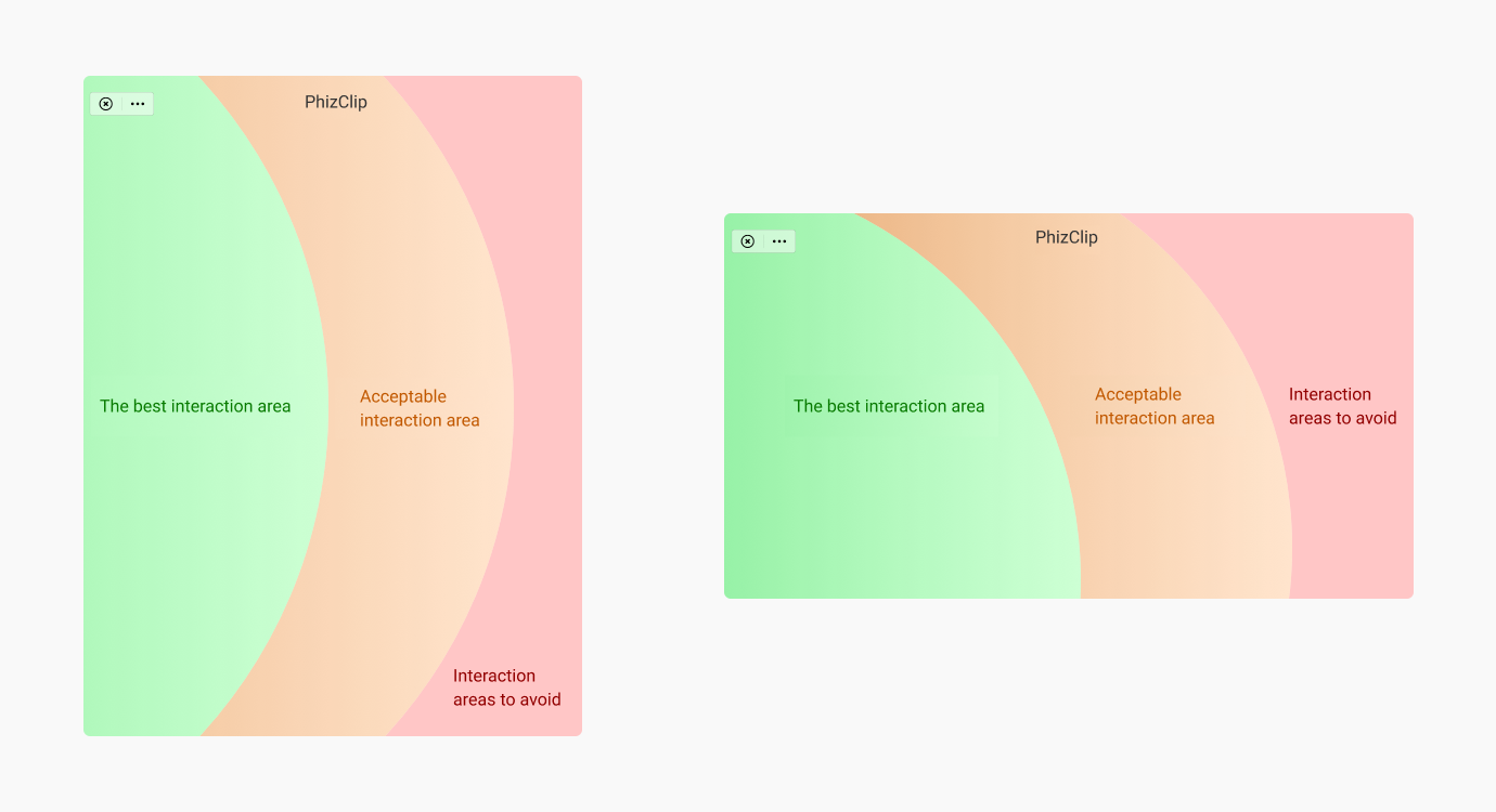
3.3 Interaction adaptation of the car tablet side
The car tablet side should give priority to driver safety as a prerequisite, the interaction area should be clear and readable, easy to operate, to meet the vehicle driving to complete the simple interaction behavior